Klaviyo A/B Test: Product Launch Email Campaign
For this project, I designed and executed an A/B test email campaign in Klaviyo for a product launch scenario. The goal was to test subject lines and layout order to improve open rate and click-through performance. The campaign was responsive, brand-aligned, and integrated product data directly from Shopify.
A/B Test Setup
I created both versions using Klaviyo’s built-in A/B testing tools. The test audience was a 50/50 split from a segmented list, with performance tracked for open rate, click-through rate, and attributed revenue.
Version A
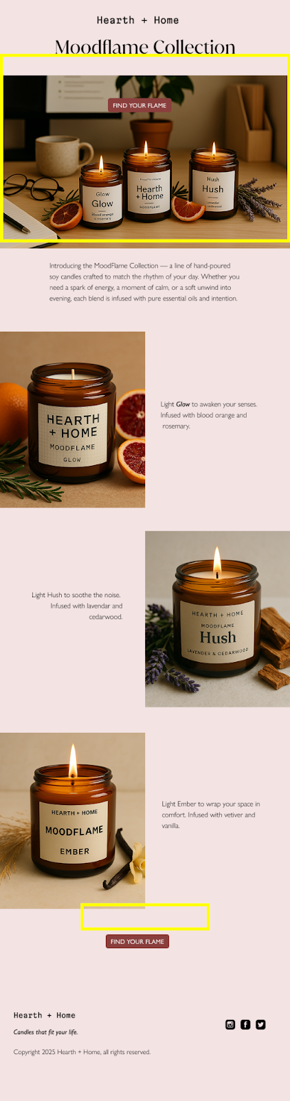
Focused on product collection hero image and "Find Your Flame" CTA
Version B
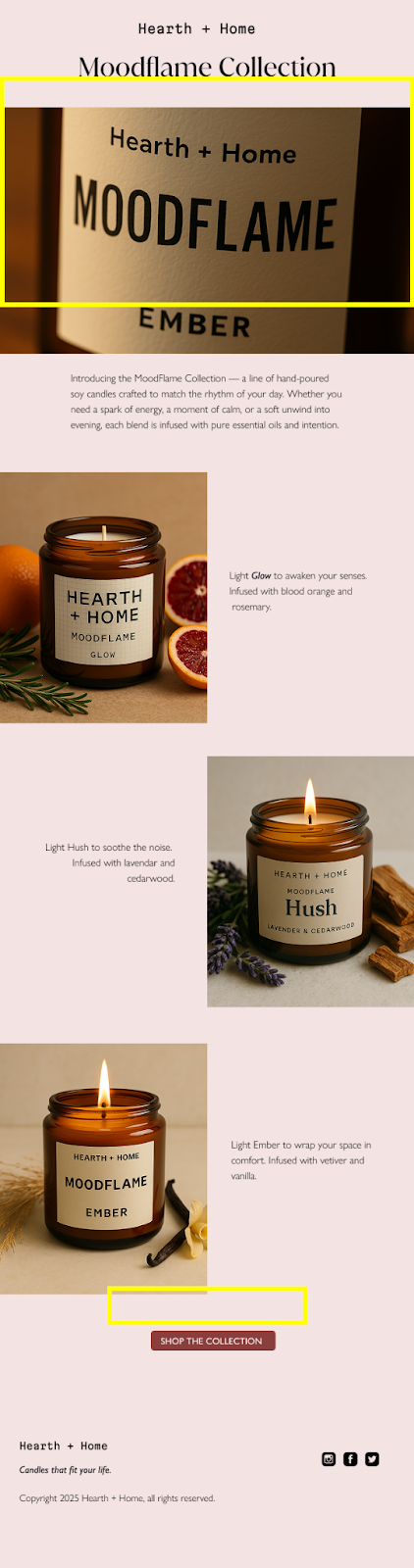
Hero image focus on closeup of label and "Shop The Collection" CTA
Results
- Open rate: Similar across both versions
- Click-through rate: Higher in Version A — users preferred broader visual context
- Time on email: Longer in Version A — indicating deeper engagement
The full collection layout provided stronger visual context and brand cohesion. Users were more likely to click through when they could see multiple products rather than a single detailed close-up.
Reflections
This test confirmed that context-rich visuals outperform isolated detail shots — particularly when marketing a product line that thrives on aesthetic appeal.
While Version B felt more intimate and crafted, it lacked the invitation to explore. The broader layout in Version A gave subscribers a fuller narrative to engage with.
Key takeaway: Even minimal layouts benefit from breadth. When in doubt, show more — not less — especially when storytelling is visual.